


Implement the Design
Summary
To take visual design and turn it into a fully functional (and responsive) web design is a mix of programming, math, and human interaction.
Does This Apply?
This will affect you. Every website comes down HTML being loaded into a browser and interacting with other resources like CSS and JavaScript. You might not write this code yourself, but there are dozens of factors that a developer is going to juggle to make this work, and you should understand what these pressures and influences are, along with the basic tools of the trade.
Narrative
The need to take something from plan to implementation is a universal challenge in any creative work. A sculptor has a scale model to work from. A builder has a blueprint. A portrait artist has a subject.
The plan – whatever that might be – is in a different medium than the material or environment the final product is actually created in.
In many cases, it was developed in a controlled environment, not at all like the reality of final construction.
An architect generated that blueprint in the safe, quiet confines of their office; the builder, on the other hand, is the person standing out in a field in a South Dakota winter, looking at a piece of paper, comparing to a pile of building materials on the frozen ground, and hoping that the final product matches the plan. Such is the life of a creator.
This entire book has been an exercise in moving from theory to reality. This story started with you just thinking about your goals and dreams. From there, you slowly refined the idea, resolving questions and issues, getting a little more concrete with each round of changes and considerations. You went from audience needs to rough sketches to now – a design, ready to be implemented.
You’ve finally arrived. We’re ready to build something.
Some time ago, you got a design from someone. This isn’t a web page – it was probably a file from a design application like Adobe Photoshop or Figma1. This is a representation of what a web page should look like. It’s really just a theory. Now, you need to implement that design, which means turning it into a functional web page that can load into a browser and perform in all the ways we expect from a web page.
Clearly, we’re not going to teach you how to code. But we are going to introduce you to some coding concepts so you’ll have an understanding of what goes into it and what to look for when you get to this point in the project.

Episode 19: Implement the Design (w/ Ethan Marcotte)
Corey and Deane talk about how front-end development has evolved past the early days. Then, Ethan Marcotte, author of Responsive Web Design and Partner at Autogram, joins to discuss front-end development and how the world has impacted how front-end design is treated and approached. We also joke about whether Deane actually “invented” responsive web design. (He didn’t.)
Front-Ends and Back-Ends
In the early days of the web, there was only one kind of developer: a web developer. They did it all. They were responsible for configuring the content management system, writing the code that ran on the server, and writing everything that displayed the results. They worked with the full stack of technologies.
Over the years, this “Swiss Army knife developer” has bifurcated. As the Internet grew and matured, the possible combinations of technologies available to build a website has simply grown to an unmanageable level. There are vastly more languages, technologies, and frameworks, and more seem to pop up every day.
These technologies exist on a spectrum with two ends: glass and sand.
- The glass is the screen our users stare into; a monitor or a mobile device. A technology that’s “close to the glass” is something the user directly perceives or interacts with.
- The sand is the silicon in computer processors. A technology that’s “close to the sand” is a programming function, primarily concerned with execution by the server’s processor.
Different technologies line up in different virtual distances from where the user interacts with them. The page loaded into their browser is the most immediate, direct technology that affects what they perceive, while the operating system on the server thousands of miles away is the most distant and indirect.
If we stack up our technologies from glass to sand, it looks something like this. (We’ll focus on some of these definitions later in this chapter):
- HTML
- CSS Framework
- (Raw) CSS
- JavaScript Framework
- (Raw) JavaScript
- Network Infrastructure
- Content Management System (CMS)
- Programming Language
- Database
- Server Operating System
This corresponds to what we call front-end and back-end. Technologies considered to be on the front-end are those that are close to the glass – HTML through Javascript. Back-end technologies are close to the sand.
The dividing line is the point when the response leaves the web server. When the server has read or created something like a “page” and shipped it out the door to the browser, the responsibilities of the back-end developer are done. When the document arrives in the browser, the front-end developer’s job takes over, and continues until the document is unloaded from the browser (usually by being replaced by another document).
Specializations
Because both sides of the front-end/back-end dichotomy have become more complex, developers have come to identify and specialize with one of the other. Somewhere in the last ten years, most web developers made a career choice as to whether they wanted to work on the front-end or the back-end, and new developers make this same choice today: do they want to work with front-end, presentation-level code, or back-end, processing level code?2
Most professional services firms of any significant size will employ both roles. A team will have back-end developers well-versed in the CMS and the associated programming language. Their job is to manage the processing of data on the server and provide this data in the correct format for the front-end developers to morph it into the visual representation required for the project.
And what happened to the “full stack developer?” There are developers who are still claiming mastery of the full stack, but it usually comes with caveats. They usually know a specific JavaScript and CSS framework, a specific CMS, a specific server-side programming language, etc. They know a full stack, but that stack is comprised of a specific combination of things – call it their full stack.
Standards
Finally, there’s something to note about our stack list above: we get less specific from front to back. On the front-end, we have three specific, named technologies: HTML, CSS, and JavaScript. Moving backwards from there, we can only deal in generalities: a CMS, a programming language, etc.
This is because the technologies that are close to the glass have a common execution environment: the web browser. The developer doesn’t control the browser – their code is merely visiting while their web page is loaded. A developer’s relationship with a browser is temporary. This being the case, the governing authority of the web had to settle on a common standard of technologies for browsers to support. Thus, we can name those explicitly and expect that anyone working on the front-end will know HTML, CSS, and JavaScript.
But there is no governing authority for what happens behind the scenes. A web page can be created and served from any kind of CMS running any kind of database and any language. The server environment is controlled and known – we own this, remember – so it can execute any combination of technologies. We could invent our own programming language and use it to generate web pages, if we wanted, and no one would know the difference. Thus, back-end technologies exist on a much wider range than those on the front end. Their only requirement: deliver results in the common languages of the browser.
The Toolbox: HTML, CSS, JavaScript, and Frameworks
The tools of the front-end developer are the top five from our list above: HTML, a CSS framework, CSS itself, a JavaScript framework, and JavaScript itself. Every front-end developer will know HTML, CSS, and JavaScript, and they likely have a preferred CSS and JavaScript framework that are commonly used.
(As we explain this, we’re going to show you some code. Don’t panic. It’s merely illustrative of concepts, and you don’t have to understand it completely to get the main idea.)
Hypertext Markup Language (HTML)
“Hypertext” is a term coined in 1965 by scientist Ted Nelson when he was a professor at Vassar. Nelson conceived it as text which could reference other text, and which you could activate to reveal other documents3.
HTML is a text format that embeds formatting and other presentation information inside text. HTML is the basic format of every web page.
An HTML document consists of text interspersed with “tags,” which are represented and recognized by opening and closing brackets. HTML tags perform different functions. Tags surround text, and impose different functional and visual characteristics to that text. An opening and closing tag with its contents is known as an element.
This is some text. <strong>This text will be bold.</strong>In the example above, the strong tag is opened and closed, and contains a sentence. That sentence is given special formatting or functionality based on the surrounding tags – it would be rendered in boldface, in this example.
The opening tag might have constructs called attributes that supply additional information.
<h1 class="title">This is the title</h1>In that example, the h1 tag denotes a “Heading, Level 1.” This imparts some default formatting (large, bold) and some structural designation (the most important headline on the page), and the class attribute gives it a referable name so that we can find it again later with CSS and JavaScript.
Tags can nest inside each other – so an entire element can be contained within another element. In fact, all the HTML should be contained inside a “master tag” of HTML that opens at the beginning of the text and closes at the end.
This entire string of text is known as a document. This is what your browser loads and interprets.
HTML is the most basic technology of the web. It forms the backbone and structure of every browser-based experience.
Cascading Style Sheets (CSS)
HTML tags can impart style information to text (like the bold example above). However, it’s considered bad form to embed too much styling into HTML because it can be difficult to sort through, and a lot of it ends up being duplicated from document to document. By separating the style information from the HTML, you can manage the visual appearance of your documents much more efficiently.
This separation of styles from HTML led to “CSS,” or Cascading Style Sheets. CSS is a language that recognizes certain elements of HTML and applies a style to those elements — styles like color, font weight, spacing, and alignment. CSS is not part of the HTML, which makes it easier to manage. Essentially, it’s a kind of color-by-number – the tags within the HTML designate document-wide styles in CSS.
Referring to our HTML example above, let’s say that we wanted to color all bolded text red, for whatever reason.
strong {

    color: red;

}
That example will color red any text inside a strong tag element.
The specification of an element and the associated style information is called a rule. We can put that CSS in a separate file – called a stylesheet – and link it to our HTML. In fact, the same stylesheet can serve multiple HTML files — 100,000 different HTML files could look to a single CSS stylesheet to help determine link color, or standard image widths.
This is notable, because it allows for wide-sweeping style and design changes without the need for massive rework. For example, if we wanted to change all of our bolded text styled in the example above to, say, blue, we can change the code in our single stylesheet and the appearance of all HTML linked to it will change.
What’s more, we can combine and nest those rules to be more specific. We can say that all links are blue, but we can then further adjust this so that all links in a list are black, or that all links in a specific block are left-aligned.
CSS is technically optional – every browser has a set of default styles that get applied to different elements – but has become the fundamental method of styling a web page. Almost every single HTML document will be linked to an associated stylesheet that provides visual formatting, and many websites will have a single stylesheet to which every document is linked.
JavaScript
So far, HTML and CSS have simply allowed for the creation and visual styling of our documents. They are technically not programming languages. They allow for many quasi-programming concepts, but they don’t have full support for complete logical programming4 – things like variables, looping, and conditional statements. That’s where JavaScript comes in.
JavaScript is the programming language that executes in the browser, in the context of an HTML document.
JavaScript has nothing to do with Java, another programming language. In fact, it was originally called LiveScript. However, when it was invented in the late 90s, we were embedding small Java programs in web pages, which were called Java applets. LiveScript was viewed as a simpler alternative to a full Java applet, so the name was changed to reflect that perception.
Java applets, thankfully, are not a thing we do anymore – they were complicated to write, slow to execute, and provided an incongruous user experience. Over the years, JavaScript has matured to provide all the functionality we need.
Using JavaScript, we can manipulate our HTML document in real-time, while the user is looking at it.
For example:
var node = document.getElementById(“title”); node.parentNode.removeChild(node);To you, that probably means nothing. But to a browser, that is a small request to find an HTML element identified by the name “title” and delete it. It would disappear from the visual display of the document, in real-time. This code might execute in response to someone pushing a button, for example.
JavaScript typically works to adjust what’s called the Document Object Model (DOM). The DOM is the digital representation of a web page – all the elements, ordered and nested as they appeared in the HTML from which the document was loaded. To “manipulate the DOM” is to do things like in our example – add, delete, change, or otherwise fiddle around with elements of the DOM.
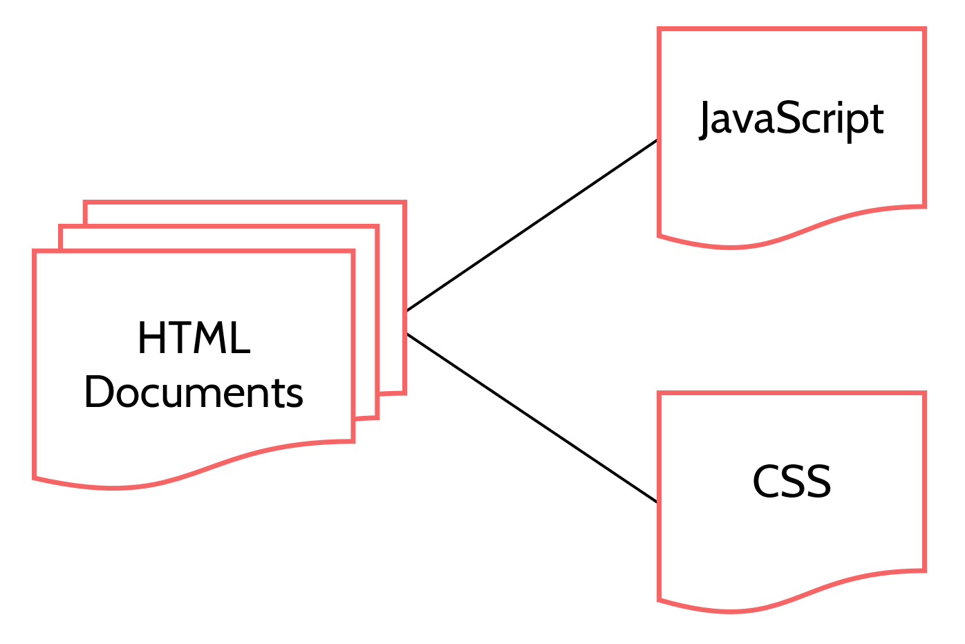
Figure 19.1: HTML documents provide structure, but are further transformed through the addition of style elements (CSS) and manipulation ( JavaScript).
JavaScript began as a lightweight programming language meant for simple document actions. However, in the two decades since it was invented, it has become an enormously popular language, and has advanced to the point where an HTML document might simply be a shell designed to load and execute a complicated JavaScript programJavaScript has also graduated out of the browser and onto the server. You can use JavaScript in server environments to do anything. In fact, you can generate your web pages on the server using a JavaScript framework called NodeJS..
CSS and JavaScript Frameworks
CSS and JavaScript have become so indispensable that frameworks of pre-written code have developed around them to accomplish common tasks. Some frameworks are simple and designed merely to assist, while other frameworks are large libraries of code with associated philosophies and methodologies around their use.
The largest frameworks are so widely known that many front-end developers use them as a default for every new project. In fact, some developers might struggle to write code without them.
Some examples:
- Bootstrap is a CSS framework designed by Twitter. It provides CSS that automatically attaches itself to HTML elements with specific attributes and handles such rote tasks and rendering them as columns that adapt to different screen sizes.
- React is a JavaScript framework designed by Facebook. It allows a front-end developer to create complicated HTML structures in JavaScript code and makes them easier to manipulate when building complex applications.
- JQuery is a JavaScript framework with associated CSS that eases many visual tasks like making elements appear, disappear, and animate.
Some frameworks are so widely used that they spawn sub-frameworks or plugins. A front-end developer might use React and a dozen React extensions to change how it functions.
Templating and Design Components
HTML documents don’t normally exist as actual files anywhere. They’re usually assembled from fragments of HTML. You can envision it as a library of separate pieces that are mixed and matched to form a document.
Every website repeats a lot of stuff, visually. The only website that would have an entirely new and different layout on every page would almost have to be an art project of some kind. If you compare one page on a website to another, they might only differ by a heading, some images, and a few paragraphs of text.
Even when the actual content differs, the structure is the same. Consider an image carousel or rotator on the home page. Every frame or slide of that has the same basic structure – image, headline, maybe a few sentences of supporting text, and a link somewhere. The slide itself is a common structure, just with different content injected into it.
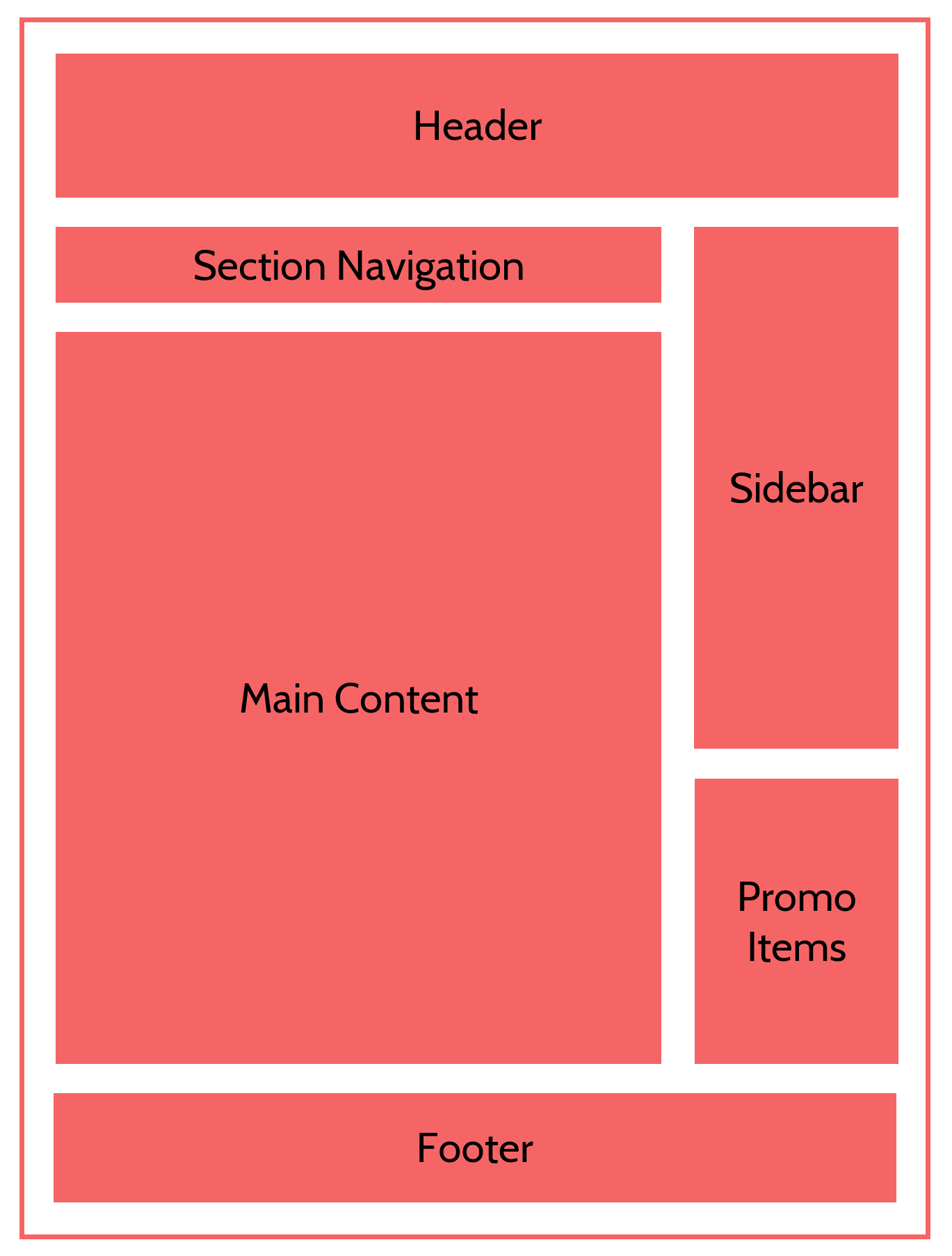
Figure 19.2: A standard page template that includes a header, footer, main content, and navigation areas.
Therefore, one task of a front-end developer is to determine what the repeatable elements of the design are. The developer will view the entire design, note what elements repeat, and figure out how to draw those out into reusable libraries of code, called design components5.
A goal of components is consistency and efficiency. You want this to look the same on every page, and you don’t want to re-code it every time. By identifying things like this as repeatable components, the front-end developer can employ techniques to “lift them out” of specific documents, maintain them separately, then “inject” them into documents that need them.
This assembling of documents from HTML fragments is a function of templating. Here are a few different ways this happens:
- Server-Side Includes: Some tags or tag-like structures can be detected by the server when it’s reading the file to send the response. The server can replace those tags with the contents of other files. Thus, your header component could exist in its own file, and be injected into every document at the instant it’s being returned from the server. If it needs to change, it can be changed in a single file.
- Server-Side Rendering Languages: Some full programming and templating languages exist that allow logical, procedural computer code to be interspersed with HTML. When the document is requested, this code is executed. It generates or hides HTML constructs in the document, meaning the document “writes itself” at the moment of response.
- Client-side Templating: Using JavaScript frameworks like React, design components can be created in the browser, and they can populate the content around themselves by making special requests to the server.
In all the cases above, the HTML document that finally displays in the browser doesn’t actually exist as a single file somewhere. It’s assembled from a series of design components, either on the server or in the browser. This rendering does two things:
- Generates HTML tags and elements
- Injects dynamic content into that HTML, often from the content management system
If this is done on the server, a full HTML document is delivered to the browser, and all the theatrics that happened on the server are hidden.
If it happens in the browser, the document is essentially a small computer program written in JavaScript that executes in the browser to create a new version of itself by manipulating the DOM.
Balancing Front-End and Back-End
We’d like to say that we can totally encapsulate the front-end development to a single role, but in reality, your project will likely start proceeding along several tracks in parallel here.
Additionally, the role that actually does the front-end development is not a simple answer. Roles and lines will start to get blurry.
Here are a few common scenarios:
- Strictly defined: A front-end developer will code all the HTML, CSS, and JavaScript as a set of HTML documents, then hand them off to a back-end developer who converts them into templates in the CMS. This can be inefficient because the back-end developer has to translate what the front-end developer has done. And if a change is needed, the front-end developer has to change their files, and this has to be translated again.
- Back-end helps with front-end: A back-end developer will do the templating in the CMS to generate basic, generic HTML. The front-end developer will write CSS (“apply styles”) and JavaScript against this HTML, asking for changes to the HTML when needed. In this case, some of the front-end development (the HTML) is handled by the back-end developer, but this can work since the HTML is often non-debatable, and a development team might have conventions to ensure the front-end developer gets the HTML they expect.
- Front-end helps with back-end: A front-end developer might be able to template in the CMS directly so they can generate their own HTML. This is very efficient, but some CMSs make it difficult because the templating can’t be separated from the rest of the code.
- Front-end goes it alone: A front-end developer might do client-side templating in a JavaScript framework like React or Vue. In this case, they don’t need any server-side HTML. Rather, they make requests to special URLs on the server that provide content as pure data which they render to the screen using JavaScript to manipulate the DOM. In this scenario, the back-end developer just needs to make sure the server is returning the correct data.
- Full stack: A full-stack developer might do everything. This could be both efficient and inefficient – efficient because there’s no communication or dependencies required, but inefficient because one person can only do one thing at a time, so your project would have to proceed serially instead of in parallel. Once a project gets of a certain size, it can be tough to expect a single person to do everything.
Like we said, roles get a little blurry.
The examples above provide a helpful segue into the world of DevOps, which is short for “development operations.” This is the seemingly mundane but absolutely critical aspect of a project where you figure out how people are going to collaborate on the same code and software without getting in each other’s way.
Regardless of how many people are coding a site, there is – in essence – just one site. Which means there’s always a risk of coordination issues: the output of all those people has to be combined to form a single, cohesive project. If a front-end developer is writing CSS and JavaScript, their code needs to be combined with all the back-end code to be deployed to the production environment.
Additionally, some developers might require the output of other developers to do their jobs. If I’m a back-end developer working on some aspect of integration, I might need some of the templating code from a front-end developer. And some other people on the team might need my code to test or develop their stuff.
This combining of multiple code sources into a single thing is known as building. The result of a particular combination is called a build.
Code generally works its way through multiple environments before it finally gets deployed to the live, public environment.
- Developers will write code on their local workstation. This means they usually have an entire copy of the website running on their own computer. Often this requires them to install the complete technology stack – database, programming framework, CMS, etc.
- When their code seems to be running okay, they will submit it to a source code management (SCM) system, like Git or Subversion. These are systems that keep source code safe, and track all the different versions of it. Using an SCM, you can see exactly what changed in code and who changed it, which is helpful when trying to debug something. Additionally, the SCM becomes the central clearinghouse for code, from which developers will download each other’s code to update their environments.
- When code is submitted to an SCM, it will often trigger a script that automatically builds and deploys it to an integration environment – essentially, the working copy of the site. Just by submitting new code, an entire build of the website is deleted and rebuilt with the latest submitted code from everyone on the team. This is a concept known as continuous integration (CI) or continuous deployment (CD). If you have lots of developers writing and submitting code, your integration environment might get destroyed and rebuilt dozens of times a day. Developers can submit code, wait a minute for the build, then go check to make sure all their stuff worked with everyone else’s stuff. There also might be some automatic tests that run after building to check for problems6.
- Every once in a while, the integration environment is copied to a test environment. This is where the QA team will test all the features to make sure they work and often where the client will review the work product. The test environment is more stable than the integration environment, because it’s changed much less often. You might update the test environment from integration once a week, so it stays relatively stable.
- From test, code might be deployed to a staging or pre-production environment for final testing. Some organizations might have a battery of automatic tests that run in this environment, just to make sure no problems slipped through.
- From staging, code is deployed to the production environment – the live environment – where it finally sees the light of day.
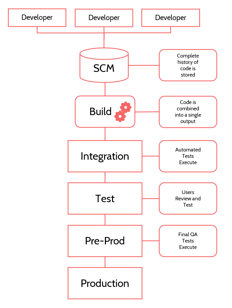
Figure 19.3: A representation of how multiple developers move code through different environments toward the launched site.
Yes, code takes a long, winding road from the keyboard of a developer to a place where customers actually interact with it. This is often called a deployment pipeline or CI/CD pipeline.
What we’ve described above is appropriate for a larger project with a larger team. A smaller project might be done by a single developer, in which case they might only have two steps: they write and test code on their local machine, and they deploy it to production.
These are two ends of the spectrum, and your project lies somewhere between them.
Front-End in Action
Now that our front-end code is live and interacting with the world, what behaviors do we need to account for?
In addition to evaluating the design for components and actually writing the code necessary to bring them to life, your front-end developer is juggling other concerns and responsibilities.
Browser Compatibility
There are lots of different browsers – Chrome, Firefox, Edge, Internet Explorer, Opera, Brave, etc. – and they’re not all equal. Occasionally, they do things a little bit differently – they might render an element in an odd way or not support some new-fangled features of HTML or CSS. For example, some older layout options work on one browser, but are completely left out of the code for other browsers.
This used to be very painful for developers, and there were notorious browsers that front-end developers had to make concessions for, sometimes to the point of coding entirely separate stylesheets just for them (we’re looking right at you, Internet Explorer 6.0). Today’s browsers, thankfully, support a more common set of features and capabilities7.
When front-end developers test their code, they have to test in a variety of browser platforms, including many different versions of those platforms. Services even exist that will retrieve your web pages in different browsers and versions and then show a grid of images representing the result.
Remember from our discussion above that there’s one server, but an infinite number of browsers, each with their own quirks? A front-end developer has to find a happy medium that works for all of them.
Responsive Web Design
Not only do we have zero control over user browsers, we have zero control over the width of those browsers, which means we cannot design to a rigid structure. We must be responsive to the device being used.
Responsive web design enables a web page to change itself in response to the browser environment in which it’s loaded, primarily in relation to the size of the viewable area. A “full” browser experience on a desktop is very different from the tiny browser on a phone, and a web page can be developed to adapt to these differences.
This is accomplished mainly using a CSS tool called a media query. Media queries allow a separate set of CSS rules to apply only when the browser environment meets certain requirements, such as the size of the viewable area.
For example, imagine a design in which all images will appear on the right side of the screen, with text flowing around them. To allow for a better view on a mobile device (when the screen size falls below 500px), we may assign two new CSS rules – we will center the image on the page, and we will remove the text wrapping, as it will not work well on a narrower browser window.
img {

    float: right;

}

    @media screen and (max-device-width: 500px) { img {

        float: none; display: block; margin: auto;

    }

}
The 500 pixels designation in this example is known as a breakpoint, meaning it’s a threshold where new rules apply – a “breaking point” for the design to change. At what widths your front-end developer sets the breakpoints is up for debate, as is the number of breakpoints they respond to. You can define as many breakpoints as you like.
Here are some examples of screen size and variability – when the width of the browser rendering area falls below the pixel width listed, the design might change for that particular environment:
- 320px: Phone in portrait mode
- 480px: Phone in landscape mode
- 640px: Tablet in portrait mode
- 960px: Tablet in landscape mode
- 1280px: Standard full browser
- > 1280px: Wide screen
For many developers, that’s too many. It’s quite common just to support three – phones, tablets, and full browsers. But your situation depends on your visitors and the complexity of your design.
Browser width is the most common usage consideration for responsive design, but media queries can act on any number of variables. You can respond to the resolution of the device (when Apple’s hi-res “retina” displays were new, some sites provided sharper images for browsers on those devices), the available color palette, or even user preferences, such as if they have a setting to reduce motion (common for some users with vision or seizure disorders) or whether they want a high-contrast color scheme.
Media queries have enabled web design to keep up with the relentless pace of new devices, brought about mainly by the revolution in mobile computing. When everyone viewed web pages on a full computer monitor, it was relatively easy for designers and developers to control that experience. Today, they can’t control anything, they can only respond and adapt to whatever environment they have.
Accessibility and General Usability
Of course, technology is not the only barrier – front-end must also help facilitate the structure and functionality of accessible websites for those who use assistive devices.
As a reminder, accessibility is a set of practices and coding conventions that seek to provide equal access to the information in a web page, regardless of physical or cognitive abilities. For example:
- Some users have visibility issues, all the way up to total blindness. These users might need higher contrast, avoidance of certain color schemes, the ability to enlarge text size, or well-structured HTML that makes sense when it’s read aloud.
- Some users cannot use a mouse, and have to navigate a web page by keyboard. The HTML needs to allow intelligent tabbing from one element to another and the option to skip over non-essential elements.
- Some users have seizure disorders that might be triggered by certain movement or color changes.
Accessibility overlays a bit onto responsive design in that browsers are now providing settings to allow users to specify when they have accessibility needs, and CSS and JavaScript can request this information and use it to modify the layout and functioning of the page.
And, fittingly, accessibility overlays quite closely with general usability. A web page that’s difficult for someone with disabilities runs a very good chance of being difficult for lots of other people too. Conversely, an accessible page is likely also a very usable page overall.
Simply put: there is no one universal user. Every user exists on a spectrum of physical and cognitive abilities, and we can’t design pages solely for the most capable end of that spectrum.
Performance
A lot of CSS and JavaScript will exist in separate files, and these files will need to be linked to the HTML document being rendered. In addition, all the images in a website likely exist in separate files. In some cases, dozens or even hundreds of supporting files might need to be downloaded just to display a single page of content.
This requires multiple connections and download time. These days, a web page is basically a computer program that has to be downloaded and executed by every user. Additionally, our HTML document might not be fully functional right away. The document might display itself, then, as different resources load, react to the information those resources provide or the functionality they dictate.
What we’re saying is that there’s a lot going on, and this can cause the website to slow down. To avoid dragging down performance, there are a number of things a front-end developer might do. They might combine separate CSS or JavaScript files into a single file, or they might optimize background or structural graphics to reduce file size.
The goal is to provide the desired experience with as few file requests as possible, using the least number of bytes possible, and causing the least amount of disruption as resources are progressively loaded by the web page.
Striking a Balance
The role and responsibilities of front-end web developers have changed enormously over the last decade. Front-end code has transitioned from simple presentation into a full execution and development environment. Some of the most complicated code in your project might be in the combination of HTML, CSS, and JavaScript that executes in the user’s web browser.
Front-end developers have the additional challenge of coping with a variable environment of different browser brands and versions, screen sizes, capabilities, connection speeds, and user abilities. Stability and predictability goes out the window. Their code has to be flexible and responsive, adapting to the environment.
It’s like trying to perform a ballet on the deck of a ship in a hurricane while balancing a house of cards on your nose. Consequently, front-end developers have moved from being basically non-existent as a distinct role to being hugely in-demand rock stars in the development world.
Front-end development is about concessions and striking a balance between hundreds of different factors. Be flexible, and understand that making things amazing for a small percentage of users is less valuable than making something beneficial for the overwhelming majority.
Inputs and Outputs
Before you can implement a design, you need one. The output of this process should be a set of files that represent the design in HTML, CSS, and JavaScript. Those files might be standalone, awaiting conversion to back-end code by another team (different development models were detailed in this chapter). In other cases, the files have templating code in them, or constitute an entire client-side application.
Either way, the output is code.
The Big Picture
By the time this happens, development is in full-swing. This is one of the two big categories of development, the other being the back-end, server-side development. Both of these tasks can usually proceed together, in parallel, and they often have to, as they inform and provide information to one another.
Staffing
This job has to be done by a developer. In some cases, this will be a dedicated front-end developer. Other times, a “full stack” developer might be working on the entire project, or a primarily back-end developer will do double-duty. Either way, the person who does this needs to know the basic tools: HTML, CSS, and JavaScript.
Resources
Articles
- “Atomic Design,” by Brad Frost
- “Frontend Design,” by Brad Frost
Books
- HTML5 for Web Designers by Jeremy Keith & Rachel Andrew
- CSS3 for Web Designers by Dan Cederholm
- Responsive Web Designers by Ethan Marcotte
- JavaScript for Web Designers by Mat Marquis
