


Develop the Graphic and Interface Design
Summary
With knowledge of the content and how it’s organized, along with your organization’s marketing assets, you can visually plan the site from wireframes to fully rendered design.
Does This Apply?
In a full-stack project, this applies – in fact, it’s often the very reason a web change is happening in the first place. But it also applies to nearly every kind of partial-stack project – essentially, anywhere layout creation or changes, mobile adaptation, or brand alignment needs to take place.
Narrative
Planning a website involves a lot of meetings. Meetings to gain alignment on requirements and meetings to clarify audiences. Interviews with stakeholders and workshops involving sticky notes. Working sessions to shore up existing content and brainstorming sessions to work through the site map.
These meetings are important, because these meetings define our project – they save time later on by helping us understand the scope and purpose and audiences, and they help us gain traction and buy-in within our organizations. But they all seem to have one thing in common: there’s always one person who seems to ask, either out loud or in their head …
“So, like … when do we actually get to see this thing?”
Everyone wants to get to the design phase. Everyone wants to see a thing. That’s when the site feels real.

Episode 13: Develop the Graphic and Interface Design (w/ Sam Otis)
Corey asks Deane welcome Sam Otis, lead designer at Blend Interactive and designer of The Web Project Guide, to talk about his history in design — from Flash to responsive web design, what young designers need to know about the web, and what he wishes clients would stop doing.
What is Design?
Design covers a lot of ground. It’s a sketch that shows something to be executed. It’s an underlying scheme that governs function. It’s the arrangement of details in a product or work of art. It’s the creative process of executing aesthetic or functional designs.
Design is all of these things (and more), but designer Mike Montiero defines design as “how we communicate what an object does, or its function, through its shape or form.1” Which means, in reality, everything we’ve written about over the last dozen chapters – from stakeholder alignment to information architecture to content layout – is in some way design. It’s more than just a layer of paint on a fading house; from location to architecture to interior to, yes, even the paint, it’s the entire process of homebuilding.
In this chapter, we focus on how design takes what we’ve learned – from expectations to content model – and translates it into a communication of function, both in traditional graphic design and web-focused user interface design. It’s time to talk about what your website will look like, how interactions are organized and laid out for various viewpoints, and how your site communicates your organization’s brand attributes.
Some Design Definitions
Of course, it’s not that easy – not in this world, where the practice of design has been segmented into smaller pockets of expertise. Within the world of web design is a scattering of sub-disciplines.
It might feel like rocket science, but really all of these disciplines help define the larger scope of what “design” is:
- Graphic (or Visual, or Communication) Design: This is what many of us think of when we first think of design – the pictures, colors, and typography of a website. If you think of design as creating a logo or a full-page ad, that’s communication design.
- User Experience, or UX, Design: User experience design focuses on how a user interprets and navigates your site, and takes into account many of the principles outlined in the content and organization chapters. It dictates how a site works when you perform certain actions. It’s also sometimes called interactive design.
- User Interface, or UI, Design: The actual design of the interfaces you come in contact with. Taking elements of both user experience and graphic design, UI design is particularly focused on things like form layout, buttons, and other interaction methods.
- Information Design: Closely tied to both content modeling and data visualization, this is a special subset of design that’s focused on presenting information in the most readable way.
- Front-end Design: The translation of graphic design into workable code. This is more than just a pixel-by-pixel representation; front-end design interprets the design to work at different screen widths, and makes sure graphic elements are visible to (and usable by) assistive technologies.
Elements and Principles of Web Design
While that list of sub-disciplines might make web design feel like a fractured landscape, it’s meant to show how the framing mechanism around web design – despite appearing along the same branch as material or traditional graphic design – requires an entirely new way of thinking. In fact, one of the biggest struggles of early web design was educating those new to the process that web design doesn’t simply follow the same rules.
To be clear, it still follows the same principles. Good design is always concerned with harmony, balance, and hierarchy, and web design is no different. However, there are two factors that, in part, differentiate web and tech design:
- We’re adding a layer of technology atop what had traditionally been a physical media (communication design).
- We’re removing many elements of control from the final product, including canvas width and content.
Design for the web is less about a single thing, and more about a set of patterns – a system by which layout and content are presented. In fact, if we think about how design manifests on a webpage – laid out by HTML, styled through CSS, and populated with content from a database or content management system2 – we better understand how design is really not about a single page or feature. It’s about a complex system of elements and patterns coming together based on a set of programming rules.
And if that sounds like it detracts from art and inspiration, then you could say the same about a well-designed teapot, or a memorable brand logo. If design doesn’t work, was it really well-designed in the first place?
Designing for User Experience
To follow this idea that design is not merely an aesthetic adornment, let’s focus first on the idea of user experience – of designing the journey upon which brand standards and typography will interact. In most cases the act of designing layout and interfaces – including interactions, content and element hierarchy, and the very patterns by which the site will be built – begins early, before the more traditional graphic design process. There is a natural progression from the vague feature requests we saw in earlier chapters toward the more structured templates that started to take shape when we talked about content modeling.
While we often view our sites as a set of pages, in reality our site is a series of interaction points. Designing the user experience is about designing the pathways through these points, including:
- Point of attention: what elements do we create and prioritize to get the attention of the site user?
- Point of interaction: what elements signify interaction and how do we show success or failure?
- Wayfinding: what elements help guide us to other areas beyond our initial goals, or what elements help us confirm we’re in the right place?
User experience design does not require a deep understanding of brand attributes, so it’s most often communicated through content hierarchy and layout, using something like a wireframe or prototype.
Wireframes
Akin to an architectural blueprint, wireframes are representations of layout and function. They’re often greyscale, devoid of images, and very rough … and that’s exactly what they’re supposed to be – their low-fidelity nature makes them effective tools for communicating functionality, allowing for important interaction decisions without the distraction of brand colors or fonts.
The actual deliverable of a wireframe will vary based on your project. Napkin sketches might qualify as wireframes. Organized walls of Post-it notes might qualify, too. While the name itself is a call back to the kind of spartan sketched design that preceded 3D modeling, today’s wireframes come in a lot of shapes and flavors, depending on your project needs, from low-fidelity sketching to high-fidelity design files.
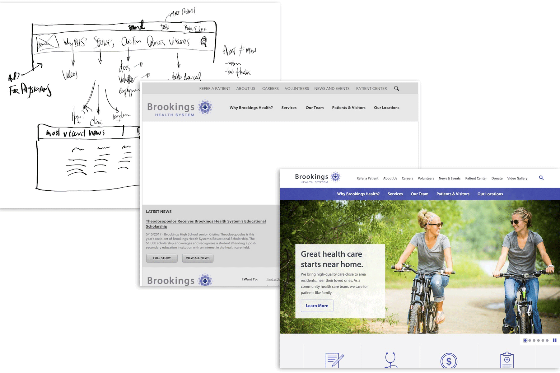
Figure 13.1: Three stages of progressive wireframe design: an initial whiteboard sketch, a high-fidelity grayscale wireframe, and a final design mockup.
Wireframes help validate and confirm layout before going too far toward visual design and branding. But what if you want to have someone actually test those wireframes?
Well, then we’ve just crossed the line into prototyping.
Prototyping and Wireframe Testing
Your wireframes mean nothing if the interaction points do not resonate with site users. Enter the world of interactive prototyping, where you get to take those spartan designs and turn them into … clickable spartan designs.
Prototyping tests your design against the habits of your users. While we often feel a level of accomplishment when flat designs and site map spreadsheets are approved by a leadership team, in reality they need to be vetted. You need real people to find (or sometimes miss!) the “sign up” button, and you need someone to say out loud that they “don’t understand what About means in the navigation.”
Prototyping and testing have many different forms, depending on what you want to actually test. Often, this plays into the research and user testing we discussed in the discovery sections of this book, and just as the fidelity of wireframes falls on a spectrum from napkin sketches to nearly complete design, the complexity of prototypes can range anywhere from rough paper sketches to fully interactive websites.
- Paper Prototyping: Simply print out some sketches and ask people to reflect on the layout and interaction points.
- Wireframe Prototypes: For this, you’ll take those wireframes and connect them using a program like Adobe XD, Figma, Invision or Sketch, allowing users to click through interaction points.
- Developed Prototypes: Now you’ve developed a base level site that approximates either the basic HTML layout of the site or a close-to-complete design. This is most often used for higher-profile projects that can progressively develop toward full launch.
Visual Design
When people think of “design,” they most often think of graphic design: of how something looks; of colors and typefaces.
In reality, some of this is true. Web design does take these things into account: there is a direct line from what might be called “traditional print design” and the elements we see in modern web design.
The difference is how it’s applied: graphic design on the web is tied to elements and building blocks, rather than the finished art of print. We have limited control of the canvas in this sense, so we’re not building for the perfect approach.
Instead, we create dozens of design elements which are then grouped according to their need. Within all of this is the concept of a design system, which is based on three major touchpoints:
- Brand Identity: The assets that make up the overall design, including logos, graphics, photography, typography, colors, and even animation guidelines.
- Design Language: The general atmosphere and guidelines that govern your design.
- Pattern Library: The individual elements that make up the larger templates, and their points of interaction.
Brand Identity and Design Language
Just as voice (the way a brand sounds) and tone (how voice translates in specific situations) are two similar but separate concepts within web content, brand identity and design language are two intertwined concepts within graphic design.
Brand identity focuses on the visual elements that separate your organization from others. These may already be in place when you begin designing your site, but you should not take these assets whole cloth: because the web is an always-adjusting landscape, your branding will adapt for different situations.
Design language, on the other hand, focuses on defining the overall atmosphere of the design, and in fact a design language is often a byproduct of the more rigorous work of creating patterns and brand assets.
Because design language is sometimes vague – just as the voice of your content can be vague – we have to come up with unique ways to document it. Upon launch, design language is documented as a style guide of situational design scenarios – “If you are creating a bio page, make sure the image is properly lit and aligned to the right” – but during the design phase it may be developed using a mood board or style tile.
- Mood Board: A mood board provides a collage of inspiration, both from the web and from the real world. As Sam Otis, Blend’s lead UI developer (and designer of this site) says, “It’s like a wireframe for the visual design.” It focuses discussion on the visual elements separate from the content or page hierarchy, and as such is more loose and open to interpretation. You can imagine it like a Pinterest board for your website.
- Style Tile: A style tile provides the basics of the brand identity, but in the same single page style of a mood board. Style tiles tend to be more concrete and higher fidelity than a mood board, including actual fonts, colors, and graphic assets that the full design will use. We often use a style tile as a design checkpoint to confirm design standards before we begin work on actual content templates. You can imagine it as a first pass at a site brand standard.
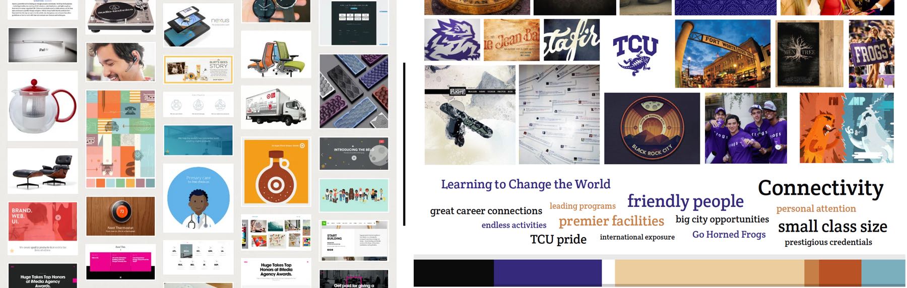
Figure 13.2: On the left, an example of a mood board originally published as a part of Marissa Epstein’s post on “Why Web Designers Should Moodboard” on the right, an example of a style tile originally created for a Blend project.
These are not separate practices, and in fact they always influence each other. Your brand identity doesn’t just dictate the color – it helps inform how colors are used within the overall design language, as well as how it is used within a unique element of the pattern library. Those unique patterns are governed by the voice of your content, and they are shaped by the design language you’ve chosen. They include:
- Brand Alignment: The various ways in which the design will pair with and accent existing brand materials and collateral.
- Visual Hierarchy: The way different elements are given priority – both in visual style and via layout – across the site.
- Typography: The typefaces and font styles3 you use to represent content on your site is one of the largest drivers of readability, which should come as no surprise. However, understanding fonts – just as with anything in a mobile world – also means understanding how to adapt fonts for different screen widths, zoom levels, and even perceived reading distance.
- Color and Contrast: Page contrast is important for those with low vision, but it’s also crucial for anyone who spends time reading on a screen. Our eyes can experience fatigue like any other muscle in our body, so providing a low-stress, low-strain combination of colors is beneficial to users.
Pattern Libraries
This all ties directly into the underlying practice of graphic web design: the idea that elements rule over static complete design.
For example: with a brochure, you create one of everything. One title. One block of content. One background. One size. If you need another size, or if you need to adapt collateral for a different medium, you create it all again. You copy the original file, and you resize everything. All of the elements might be similar, but they’re not the same exact file.
On the web, things are a little different. There was a time that every individual page required its own lines of code, an insufferable practice that made design on the web nearly impossible. And then: Cascading Style Sheets, which changed a website from a giant pile of individual text files into a series of coded patterns. Now, instead of recreating a promo block on your home page every time the page width changes, your site is smart enough to provide a reusable pattern.
What this means is that visual design is no longer tied to individual pages, and instead to a library of patterns that, ultimately, make up the entire scope of what you see on a site.
In Brad Frost’s book Atomic Design, he calls this modularity. In discussing the movement from “page” to “element,” Frost writes:
What is an interface made of? What are our Lego bricks? What are our Subway sandwich pieces that we combine into millions of delicious combinations?
Pattern libraries identify those Lego bricks and Subway sandwich pieces. They go deeper than the template – and even deeper than individual components or blocks – into the individual elements that you’ll use. Rather than recreating a button style for each component, you’re going to create one set of buttons that are used everywhere, promoting consistency, lowering the amount of code that needs to be written, and making everyone’s life a lot easier.
Managing Images
Because text can reshape to fit a new width or height – because the things we write are made up of small elements, and a sentence can effortlessly flow into a new container rather easily – we can develop a site design with the confidence that it will still be readable no matter the width or layout. This is not necessarily the case for images.
Template and site design must account for what an image will do when it’s forced into smaller widths, or what will happen if the image cannot load correctly. Sometimes this means finding a new place for it to live in order to retain its dimensions. Sometimes this means swapping out the image with a mobile-friendly version to improve page speed or presentation.
We often think things just look better if the images look great. But a site that’s overdependent on images can lead to a lot of trouble. We won’t tackle the entire scope of image maintenance and design here, but here are some points to remember.
- Images are large and slow: Large images and groupings of images – especially stacks of images in a home page carousel – seriously drag down page performance. While there are ways to adjust the weight of images and their effect on page load, a good rule of thumb is the more images you throw into your design, the more your page speed is at risk.
- Images are not accessible on their own: Screen readers cannot read images within your content in a reliable way, which is why we assign alternative text to them. When designing with images, imagine every image as a blank spot: what text can you provide that helps the user understand the purpose of those images?
- Images should be separate from text: Following that note, remember that if your image cannot be seen, neither can any of the embedded text within that image. Rather than embedding text, structure content so that the text is a separate field overlaid on the image.
Designing for Mobile … and Beyond
While there are a lot of things we can control on our site – the content, the images, the design, the functionality – there’s one crucial thing that we cannot control: the container in which site visitors view our content, images, design, and functionality. While this often focuses on designing for mobile, we’re really talking about designing for any and every screen size, which means we need to rethink how we approach our content in the first place. We have to be responsive.
Design on a Fluid Grid
In order to design in a site that can standardize along different mobile widths, we have to introduce some level of standardization within the content and templates themselves. This can be done by imagining the site as a series of columns and designing within those restraints, a concept defined as a “fluid grid.”
What this provides is guidance toward the allotment of space each element gets as it moves through different widths, and makes spacing between elements both consistent and standard. Proportions stay the same because elements are not based on pixel widths or any other static measurement, but instead are based on percentages.
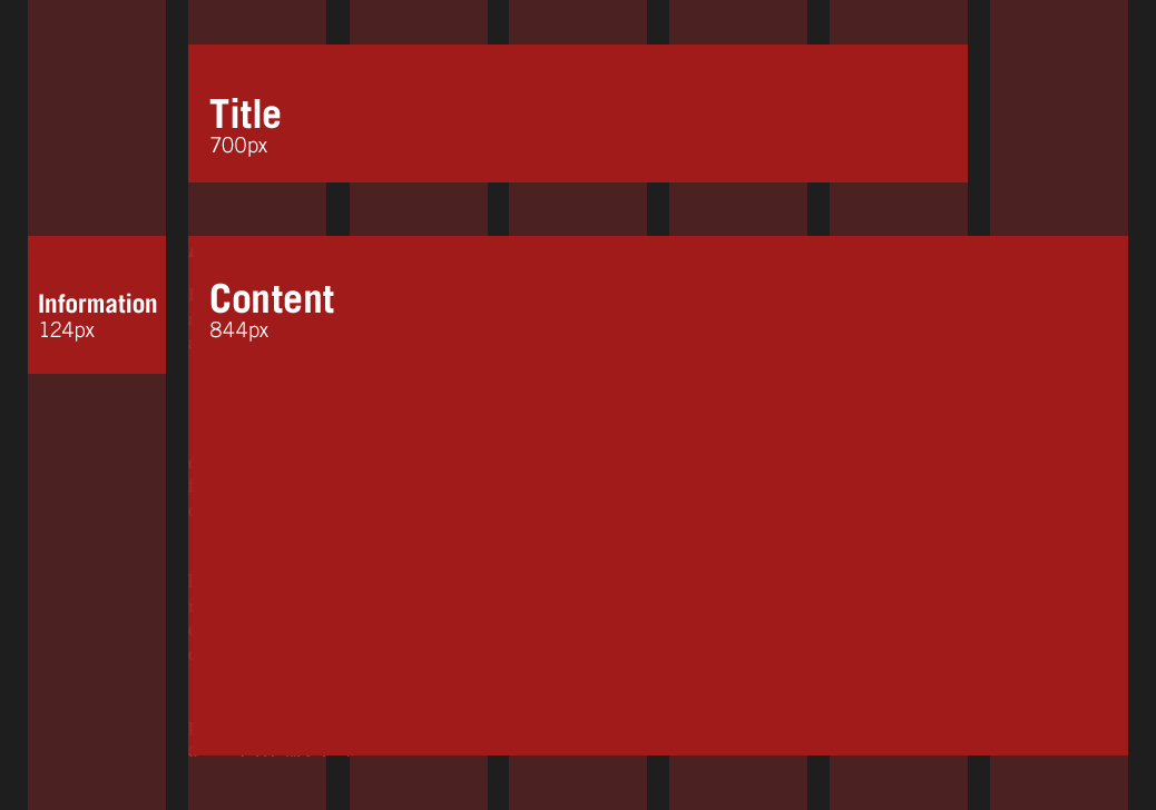
Figure 13.3: An example of a fluid grid, originally posted in Ethan Marcotte’s article “Fluid Grids” for A List Apart.
Designing to Break Points
While the basics of responsive design dictate a constant, subtle adjustment of layout based on the width of the screen, there are points at which the components simply no longer work in the same arrangement, necessitating a full re-configuration. These are called breakpoints, and they’re fueled by something in the CSS called a “media query,” which defines certain pixel widths as points where the page layout needs to change.
You’ve maybe seen this if you take your browser window and slowly change the width – you’ll see a slow change in content as it retains the same column ratios, and then BOOM! you’ll see actual page elements move and readjust. That’s a breakpoint.
When we wireframe, we often begin designs at the traditional mobile width (the width of a smaller mobile device in portrait mode) and at full width (the smallest usable width for a full-screen laptop).
And On to Integrations
A website is more than just your content and your design; it’s also a collection of external elements. Things you need to better track information (like Google Analytics) or things you need to assist with collecting money (like Square) or even things that tie to information held outside of your site (like curriculum records through a tool like Banner).
And while you can sometimes adapt the design and control the content, you also have to make allowances for how those integrations interact with both existing content and your users.
What happens when you invite someone else’s code into your website? We’ll talk about that in the next chapter.
Inputs and Outputs
The main input of the design stage is a good understanding of user behaviors and expectation – knowing how someone will navigate their way through interaction points. Other inputs include more traditional graphic elements like existing design standards, as well as content and template-focused documentation like content model needs.
There are different outputs depending on the project. You may choose to provide wireframes, or you may go all the way to prototypes. Some may simply go directly to visual design – and this visual design might actually be delivered as front-end code, which we will talk about in a future chapter.
The Big Picture
Design rarely happens on its own. To provide responsible design, you need to know the content it will serve and the templates it requires. You need to have worked together with any larger branding initiatives.
Additionally, while design might be a separate phase in between “content” and “development,” more likely visual and responsive design is handled in concert with both.
Staffing
You need a designer who understands the web – templating, pattern libraries, and accessibility. Beyond that, the designer might take on other aspects of the design: they may also be a front-end developer, or they might take on some of the more strategic tasks of wireframing and user interface design.
Resources
Articles
- “Understanding Web Design,” A List Apart, by Jeffrey Zeldman
- “Why Web Designers Should Moodboard,” Lullabot, by Marissa Epstein
- “Fluid Grids,” A List Apart, by Ethan Marcotte
Books
- Don’t Make Me Think by Steve Krug
- Paper Prototyping by Carolyn Snyder
- Communicating Design by Dan Brown
- Responsive Web Design by Ethan Marcotte
- Design is a Job by Mike Montiero
- Going Responsive by Karen McGrane
- On Web Typography by Jason Santa Maria
Resources
