


Organize Your Content
Summary
Your site won’t just magically arrange itself. Instead, you must provide organization in a way that speaks to those who visit your site. What labels do they expect? How do they get from one section to another? How do they hone in on an information scent?
Does This Apply?
Just as anyone wants to know their way around a hotel or hospital when they arrive, the people who visit your site need to know where to go to get what they want. They have expectations, and those expectations are managed somewhere on your site. Your first step is to get them there, provide them with information in a way they understand, and minimize frustration as they navigate the vast pool of information your site contains.
Narrative
Anyone who has lived in a high-traffic, vehicle-centric city can attest to at least some kind of failure in urban planning. Boston is home to a choked bottleneck, as roads wander along old footpaths. Houston pushes hard against any kind of zoning, leading to a rich and confusing tapestry. The suburbs of Washington D.C. shun any of Pierre Charles L’Enfant’s main city design in favor of standard suburban sprawl, leading to a mishmash of styles and growth that has led to the worst traffic in the country.
These may be common examples, but they’re not solely located in major cities. Even here in the gentle community of Sioux Falls we run into issues with a proposed entertainment district, bottlenecking on a major thoroughfare, and a sprawl unhindered by any natural barrier.
No city is built with the idea that it’s going to be impassable. In reality, cities are built with the best of intentions. The entropic nature of humans and the constant change of improving technology, however, have no such intentions. A city is planned in a room and tested through chaos. Thoughtful organization of a city requires a lot of planning, a lot of luck, and an awful lot of patience.
Everything we’ve said above plays into the idea of keeping a website organized. Your site is a city, and within it lies all of the same issues: thoughtful zoning and organization; effective and useful channels by which to travel; and accurate navigation and wayfinding. In a city, this is called urban planning. For your website, this organization of content and the paths for discovery fall under the discipline of information architecture.
While it might make sense on a superficial level, comparing the entire discipline of information architecture to urban planning glosses over the nature of information and how we create meaning among relationships. It isn’t enough to create a road and label it correctly, or to put a few pages next to each other. Content doesn’t take up space, which means most actions are, in a way, metaphorical: how you move through content is represented through placement in design, but it is also managed behind the design. Peel back the visual layer of a website, and you’d see hundreds of threads connecting each page, element, and navigational label.
In this chapter, we will set aside the title of “information architecture,” just as we set aside the title of “content strategy” in the last chapter. Instead, we will focus on the basic elements of arranging and connecting information.
- Organizing: how content is grouped, both as collections and branches of a site, but also as elements on a single
- Navigation: the methods of wayfinding that help us move through the organization systems we’ve chosen.
- Labeling: the words and icons we use to represent wayfinding.

Episode 10: Organize Your Content (w/ Lisa Maria Marquis)
Corey and Deane chat about Information Architecture for the World Wide Web — ”The Polar Bear Book” — and then our experiences with information organization in real life. Then, Lisa Maria Marquis, author of Everyday Information Architecture and You Should Write a Book, joins to discuss how to frame information architecture for those who aren’t web people, the hidden biases in organizing content, and a bit about why you should write your own book. (We also take a critical look at Lisa Maria’s bookshelf.)
Organizing
Robert J. Glushko’s book, The Discipline of Organizing, defines organizing as “creating capabilities by intentionally imposing order and structure.” It seems harsh: imposing order sounds like something straight out of the mouth of Mrs. Trunchbull1. But it’s not far from the truth: everything wants to be messy, and systems of organization are designed to help impose their methods onto the mess that is your content.
How those systems impose their methods is going to depend on which part of your content needs to be organized:
- Information: How is raw information and messaging managed and organized on your site? When you look for a specific product, what methods are in place to help people find it?
- Structural: How are pages organized on your site? Is there a structure based on a parent/child relationship, or is it a pool of content organized through labels?
- On-Page: How is information assembled on a page? When you go to a product page, what decisions are made to the order and hierarchy of the content?
Organization can be hard, because people organize things in different ways. One person’s spice drawer is another person’s nightmare. Which means organization requires a level of planning that allows for both commonality and differentiation. We need to be able to let people find things in different ways, while still providing as much structure as possible.
Systems of Organization and Your Information
Much like how cities are organized in different ways based on their landscape, natural features, and existing infrastructure, a system of organization – such as “alphabetical” or “by audience” – provides a baseline toward how you want your site and its content to be organized.
While there are, potentially, hundreds of different systems of organization, most of them fall into one of two main categories. Peter Morville and Louis Rosenfeld (authors of the seminal book Information Architecture for the World Wide Web) have labeled these groups as:
- Exact Organizational Schemes: Dividing and classifying content into well-defined schema. Examples include alphabetical (because a descriptive name can only begin with one character), chronological (because an item can only be assigned a single period in time)2, and geographical (because an item can only exist in one place at a time).
- Ambiguous Organizational Schemes: Often subjective, these schemes defy exact definition. Examples include topic or category (because the purpose of a piece of content may differ from person to person), audience (because different people identify as different things – and may in fact identify as multiple things), and even weird hybrid themes, such as a bookstore that defines its genres by topic (mystery), audience (children), and even reality itself (non-fiction).
When it comes down to it, organization systems are a natural extension of what you need to have organized. For example, in the world of biology, Linnaean hierarchy3 is a system of organization that helps us better understand the lineage and genetic makeup of different animals. This could not be as effectively accomplished if we organized animals by hair color or chronologically. Organizing depends on your audiences. What makes the most sense for them will make the most sense for your site.
How Is Your Site Organized?
All of this is helpful in knowing how information is organized, but what about the act of organizing the actual content itself? Where does it live? What shape does that organizational model take?
For your website, your content will be organized in two potential ways:
- Hierarchical: You have a home page, and from that home page branches a tree of additional pages, each page representing a new topic. As you move down through the tree, the pages get more focused. This model is based on a relationship between what we call “parent” content and “child” content, and it often dictates site navigation.
- Categorical: Items are organized based on their common fields, and your query of a field delivers results that match your expectations. In this case, the content is organized when requested, based on the labels we give it and the organization structure we choose. This is often seen in aggregated content, such as search results, or as a feed of blog posts.
On-Page Organization
Beyond the organization of pages, we also must focus on the organization of content on a single page. While this might seem like it falls a little deeper into the court of design, in reality these are decisions of information hierarchy: when someone arrives on a page, what information is the most important for them to see?
More than just grouping similar ideas, on-page organization – such as the decision to place navigation on the right side or left side, or the choice to include one content block ahead of another – reflects an organization system based on message priority. Sections of content that are higher up on a page demand more attention. Sections that are placed next to each other in equal columns are viewed as equally important, unless some other element of design is introduced to highlight a specific column.
This is also the point in which we begin seeing the effects of an always- shifting screen width: the architecture of content on a single page goes a long way in helping us understand how a page should look when it’s on a much smaller or narrower screen.
Card Sorting
Because different people have different ideas of how content relates to itself, information architects have developed a hands-on exercise called “card sorting” that puts the power of organization in the hands of those who will use and maintain the site.
There are no secrets to card sorting – the name tells you everything: you provide a list of cards, and you ask people to organize them into groups based on their own perspective.
Your insight and results will depend on the type of card sort exercise you are willing (or able) to take on. If you are looking to organize content within an already defined taxonomy of categories, you can run a “closed” card sort, in which categories are listed and users place cards into the categories they think most represents the item. Or you can run an “open” card sort, where cards are more freely grouped according to whatever topic the users feel is right. You can even run them remotely, using an online service like Optimal Workshop’s OptimalSort.
More than anything, remember that this tactic is just that: a single tactic. You should not take the results of card sorting as unwavering law; instead, it is one of many methods you may use to help frame your decisions. As Donna Spencer says in her book on the topic, Card Sorting, “Remember that you are the one doing the thinking, not the technique.”
Navigation
If the organization of your site is the zoning and districts within a city, navigation is clearly represented by the transportation systems – roads, busses, ferries, and even air travel. It’s one thing to organize something in a logical way. It’s another to provide them with a way to get to the area they’re looking for.
This is the ultimate goal of navigation: helping others understand the thought process behind how you’ve arranged things.
Information Scent and Wayfinding
Humans are evolutionarily predetermined to seek out the best and most valuable path with the least amount of effort possible. Biologically, we seek shortcuts and rely on familiarity because that is a more efficient use of our time and energy, and it ties back to our ancestors and their need to remember the best places to find food without exerting too much energy.
This was Peter Pirolli’s take. Pirolli, Senior Research Scientist at the Institute for Human and Machine Cognition, calls this the “information scent4;” we forage for clues in order to short-cut our way to a solution. In recent years we’ve seen a shift toward a more empathetic (and less primal) term: wayfinding. It’s not just providing a trail toward your calls to action – it’s a conscious look at the balance between signals, noise, familiarity, and unfamiliarity that lead us in the right (or wrong) direction.
Of course, wayfinding is more than just an organizational method: it relies on an understanding of what people want to find in the first place. Wayfinding takes user-centered groupings and develops signs and directions upon which site visitors will depend. Wayfinding is navigation, sure, but it also includes your calls to action, highlighted links, and helpful tips. It’s deeply rooted in how people look for information, a concept that will differ from audience to audience.
The Site Map: Boxes, Lines, and Spreadsheets
When we talk about navigation, we’re usually talking about two things:
- The path someone will take to reach a specific item of content.
- The space in which a page “lives” within the hierarchy of the site.
It’s worth remembering here that while we can adjust menus and create connections between content in a way that a single page is encountered dozens of times on a site, that page also has to “live” somewhere in the site. It needs a central source. You may link to the “hours and admission” page on your site from multiple spots, but where do we attribute its actual location?
Often, this representation of navigation is shown as a “site map5.”
There are two main ways to express a site map:
- Graphical Site Map: A graphical site map consists of lines, boxes, and other symbols. It is limiting when it comes to information, but is very useful in illustrating the relationships between pages – parent and children pages, for example, as well as groupings of common content types. A graphical site map doesn’t always require the full slate of future pages; instead, it focuses on a high-level look at navigation, verbiage, and sectional hierarchy.
- Detailed Site Map: A detailed site map is a spreadsheet, which means calling it a “map” is a misnomer. Instead, it’s really a future content inventory – each page is presented in a way that both represents the content hierarchy (with child pages indented just enough to illustrate its placement within navigation) and the future state of content. Because it’s a spreadsheet, the shackles of space have been thrown aside, allowing us to not only show how a page is organized, but also what content will be on that page, its content type, and even its status during content migration.
Site maps are important because they provide clear documentation around the future or best case scenario. Lisa Maria Marquis reminds us in her book, Everyday Information Architecture, that the site map is where you document the dreaming. “It is your system’s north star.”
At Blend, we often focus on the detailed site map. Working through this spreadsheet helps us determine the scope of the content model (which we’ll discuss in Chapter 11: Model Your Content) as well as help inform clients of the scope of their future content migration (Chapter 21: Migrate and Populate the Content).
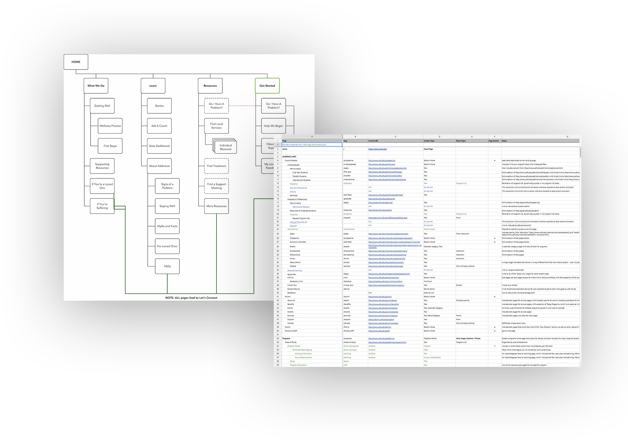
Figure 10.1: Graphical Site Map for Relationships; Detailed Site Map for Data.
But, this spreadsheet tends to become a very dense and difficult document, especially for those who simply want to know how the site’s going to be organized. This is where the graphical site map comes in handy, where we can easily sum up the future, debate navigation terms, and provide quick visuals of the site’s future during presentations and briefs.
Naming Navigation
When it comes to building a house, fixing a vehicle, or even passing law through legislature, the words we use are incredibly important. A common language is required to make these complicated processes move smoothly; to pass along information from person to person, to ensure communication and adherence of standards, and to help those entering the industry to understand the landscape into which they are treading. For example, door widths are made standard, and every part of the door is named according to an accepted taxonomy, which means anyone who encounters a door knows what to ask for and what is expected.
The world of web strategy and design still struggles with this. Part of that is tied to the creative nature of web design, but much of it is simply because we’re not asking for the same level of adherence that a mechanic or builder requires. Nowhere is this more common than when we start naming our groups of navigation.
It starts simply enough: main navigation is the top level of navigation, and this is pretty universally accepted. But now, let’s name the second layer of navigation the stuff that falls under the main navigation. Or how about the stuff that sits above the main navigation. What do you call the left or right-hand navigation on each internal page? What do you call navigation in the footer?
Well, you’re getting the universal answer for the web: it depends. We can tell you what we call these menus, however.
- Main Navigation: The main navigation of the site, sometimes called the main menu. If it expands into a dropdown of additional pages, it can be called a flyout menu or mega menu.
- Secondary Navigation: This is what we call the navigation within a section that often sits on the left or right of page content. It begins with the second level of navigation and moves down through the entire current section of the site. This is also sometimes called section navigation or left-hand/right-hand navigation.
- Utility Navigation: The top list of links that are, often, focused on more task-based sections (calendar, login, account) but commonly includes anything that doesn’t explicitly communicate the meaning of the site. Depending on site design, we’ve also seen this called eyebrow navigation.
- Footer Navigation: Navigation in the footer. This is pretty easy.
- Audience Navigation: We see this a lot on university sites, where a second layer of navigation is provided as a block on the home page, sending users to common pages customized for that specific audience.
- On-Page Navigation: We’ve built sites that include a kind of “table of contents” for a specific page, highlighting all of the headings and important sections and linking to them using anchors.

Figure 10.2: Examples of Common Navigation Elements: Main Navigation, Utility Navigation, and Audience Navigation.
Does any of this matter? The names themselves do not matter, as long as you and your team have a shared understanding of what each of them means to you.
Labeling
If organizing your site is the city plan, and navigation is the streets, then labeling your content and interaction points is the system of signage by which you identify your current place. Labels are the names you give things, so obviously they become the signage by which users will travel through your site. If you don’t provide the right label, people will not make the correct assumptions.
If you only take one thing from this book, let it be this: a link is a promise. The text of the link – the label you give it – is an explicit designation: if I label a link as “calendar,” I’d better provide you access to the calendar. Nothing rouses frustration more than a mislabeled link.
Of course, while labels provide identification to different navigation points and sections of your site, labels also serve as a form of messaging. Think of the top-level navigation of your site as a unique opportunity for providing brand awareness. While you may have bold messaging at the top of your home page, and while you might find more explicit messaging for each of your audiences within your site, there are very few spots where you can provide a level of messaging that stays persistent across the site.
Your navigation is this place. For example, the University of Notre Dame’s top-level labels include some of the usual (Academics! Admissions!), but also includes Faith & Service and Global, signifying to anyone who arrives on the site from any entrance page that they promote global fluency and provide a culture of faith and service.
Categories, Tags, and Taxonomy
Of course, labels go beyond the top-level of navigation: they also provide a way to filter and narrow down large groups of content. These are labels that provide context to our content within a larger group.
First, some definitions6:
- Categories: Categories are labels placed on content items in order to better facilitate search, filtering, or grouping. Categories are how we broadcast content topics, and link to similar content. They’re also one way we can inform the content management system’s robot brain that two pieces of content are connected, which comes in handy when you want that robot brain to give you a news feed filled with only articles about a specific topic.
- Tags: This is our book, so we’re going to go ahead and give you our definition of a tag as it relates to content. Tags are free-form. They’re created ad hoc – sometimes by editors, sometimes by users. The main difference between a tag and a category is that a tag provides more freedom, but at a higher cost of maintenance. Tags are great for quick notes or for personal organization. They are not great at being a system-wide search solution.
- Taxonomy: A taxonomy is a classification scheme, which means it outlines the rules by which a site is organized – a taxonomy is the name of the system that includes categories, tags, and metadata. This is a very high-level, general definition of the term (Patrick Lambe’s book Organising Knowledge: Taxonomies, Knowledge, and Organizational Effectiveness names two other definitions just for the word itself, let alone applications of the word) but it should get you far enough in understanding why it’s important.
What’s important here isn’t the terms themselves, but how they’re used within a site to help organize and label content. In this case, the categories, tags, and the larger taxonomy are the labels themselves. They assign meaning both to us as humans (because when we see a category of “biology,” we know through our understanding of language that the content is somehow connected to biological science) and to that robot brain in the CMS (because when a CMS sees “biology,” it knows that it’s connected to the other content items labeled as “biology”).
How categories and tags manifest within an actual working site is as a list or system of terms (taxonomy), either created, maintained, and structured by a central editorial team (categories) or created ad hoc as necessary (tags).
These terms assign meaning through their labeling, and that labeling is used either on its own or in concert with other terms.
When you can’t organize by a page tree relationship, you can still organize by these common terms. Even if a page doesn’t have “family” in the form of parent and child page relationships, it can still have “friends” in the form of common interests and labels.
Application of Information Architecture
The practice of information architecture is deeply rooted in library science and information systems, and all of this talk of taxonomies and hierarchy and ontologies can seem a bit … dense. The real question is “How does this affect me and the site I’m trying to build?”
The answer lies in one of the universal struggles of the web, which in turn fuels one of our most common requests: “We want people to be able to find what they’re looking for.” Information architecture, at its core, is about organization. It’s about making things seem logical. It’s both an exercise in tidiness and labeling; not unlike Marie Kondo’s dream of simple, purposeful spaces, information architecture focuses on making the most of the space we are given.
Which means information architecture helps us with the following:
- Knowing the hierarchy of content within a template, like the home page or an interior page, helps us make better design choices, including how content is accessed when on a smaller, mobile screen.
- Understanding how content needs to be labeled helps us make better decisions when it comes to search results, filtering options, and other aggregated content streams.
- Navigation groupings don’t just help us find things: they help us prioritize sections of the site, and they help surface content that might otherwise be forgotten.
- All of this helps us piece together all of the different content types and blocks and sentences and complex systems that we will use to help a person make their way through the site.
It’s ultimately all about organizing what you have in a way that makes sense to the people you’re designing and creating for. There’s that theme again: your information architecture is driven by user needs, which means it’s driven by users. Test for them. Create for them. Build a site that helps them find their way to your content.
A strong information architecture requires a system of pages that can support it: it needs fields for categories, and it needs pre-determined relationships, and it needs to be able to handle all of that complicated work you can’t manage as a human editor. That’s where we’re going next: into the world of content modeling, where we start giving our content shapes and we start defining just exactly what each of those templates represents.
Inputs and Outputs
You need to know your audiences and what they expect from you, especially when it comes to how they talk and what terms, patterns, and paths they’re most likely to follow. You can grab some of this during initial discovery interviews and through more information architecture-specific tactics like card sorting or site map testing.
Out of this you will get some cool deliverables that will start making your site feel more real. You’ll hopefully get a site map. You’ll develop a taxonomy of terms that can be followed for maximum organizational power. You might even use this information to help shape wireframes and the design of other high-level pages. More than anything, you’ll start seeing structure around those ideas you came up with in the last chapter.
The Big Picture
Information architecture, content strategy, and creation of a competent content model (see Chapter 11: Model Your Content) are intertwined and deeply connected. Your message’s purpose is tied to how it will be organized, and both are tied to the actual functions each piece of content will provide to end users.
Staffing
Site organization during a new site or a redesign will fall to someone with experience in information architecture. On smaller teams, this may be your web steering committee or your content strategist, but on larger teams you may have the opportunity to hire a dedicated information architect who focuses on information connections, taxonomy and categories, and other relationship-based content questions.
Because the bones of organization systems begin during the strategy phase and are baked into design, only to fall to more of a maintenance mode after launch, we see a lot of organizations bringing in an information architecture specialist for the initial build, followed by a governance plan that empowers someone on the content team to manage organization, navigation, and content connections beyond launch.
More often than not, the practices and tactics found in both information architecture and organizational (rather than editorial) content strategy are shared among people who have a mind for thoughtful organization and content purpose. Go find yourself a library scientist, or at least someone who has a well-organized record collection.
Resources
Articles
- “Flexible Fuel: Educating the Client on IA,” A List Apart, by Keith LaFerriere
Books
- Everyday Information Architecture by Lisa Maria Martin
- Information Architecture for the World Wide Web by Peter Morville & Louis Rosenfeld
- How to Make Sense of Any Mess by Abby Covert
- A Practical Guide to Information Architecture by Donna Spencer